haus of beauty by hs-artistry
a strong brand presence fosters client loyalty, encourages repeat business, and helps establish a reputable identity in the beauty industry.
Timeline: Ongoing
project
Role: Creative Design Lead - Graphic Designer - Brand
Industry: Beauty and Spa
Working together with the client who was expanding on her business in the local New England area. The project orientated around her idea of what her brand aesthetic could be and has continued to grow to this day.
Originally designed back in 2019, it has evolved into the brand that many can rely on for their beauty, bridal, and esthetician needs.
Logo
The brand features a distinct logo with various versions to accommodate for size restrictions or digital viewports.
Full Logo
Horizontal Logo
Brand typefaces
The brand uses a distinct minimal and clean typeface with the accent of a script typeface to add a piece of visual variation.
Brand Colors
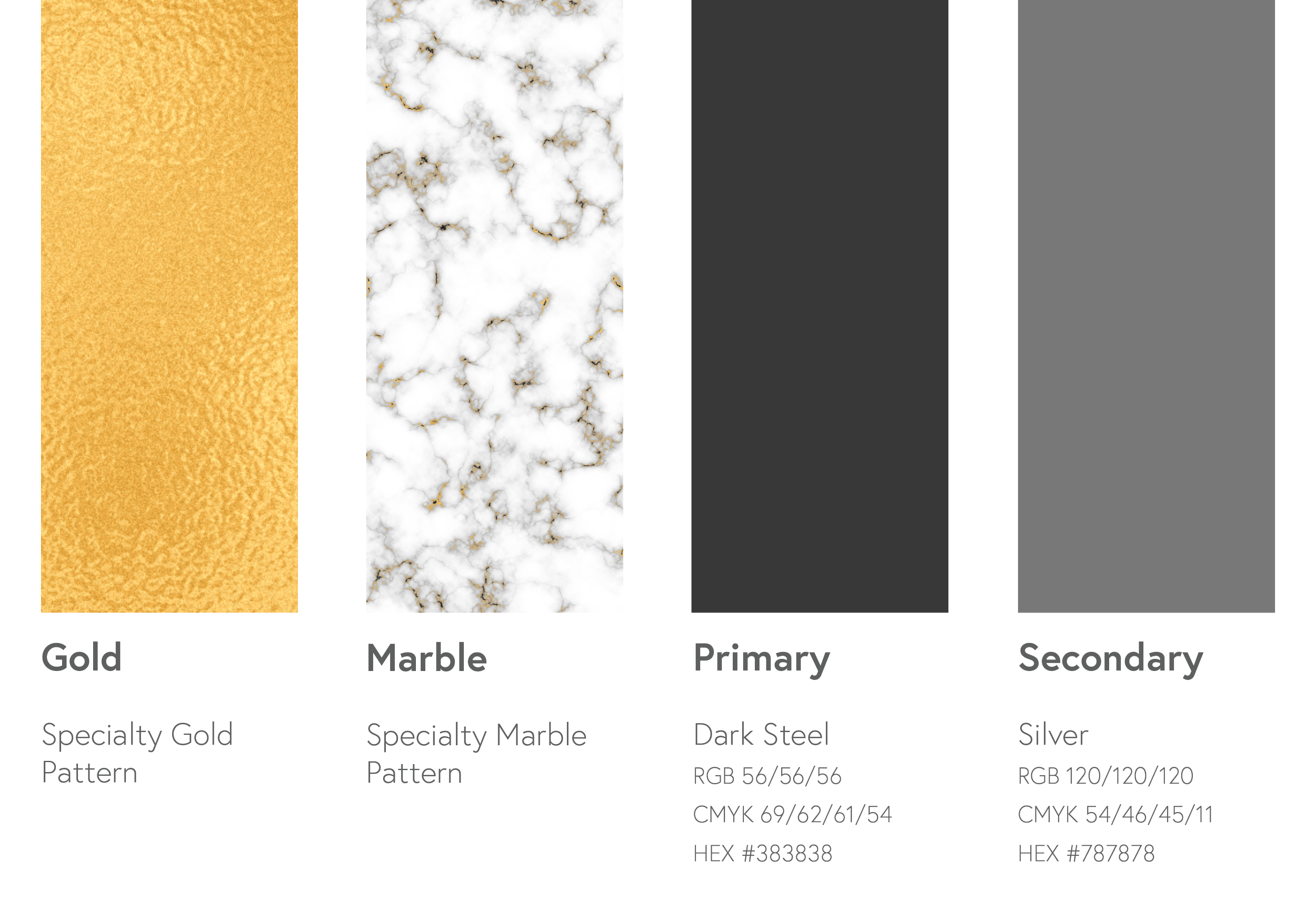
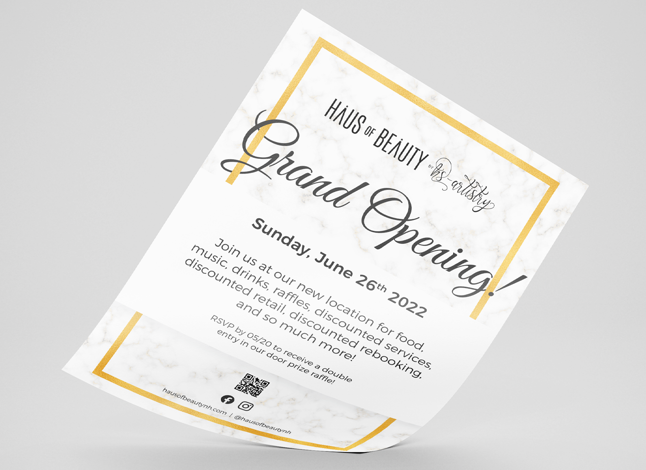
The brand style focuses on the minimal, black and white aesthetic, with pops of gold. An additional layer of white marble is the texture designed as a supplementary piece.

Business Cards
The business cards are presented in a unique square shape with a gold embossing treatment when printed. Each card type has similar treatments for employee, generic, and marketing card sets.


